30. March 2021 By Ralf Schmidt
Data visualisation pitfalls. Or: Why pies are not only bad for the figure – part 1
‘Rising rates of infection are simply a result of more intense testing’ – you will very likely have heard statements like this in recent months, and they make two things clear: On the one hand, the pandemic has turned us all into (amateur) data analysts, and on the other hand, even the interpretation of straight-forward figures seems to be anything but trivial. The presentation of data plays a crucial part in how data will be interpreted. For me, this is reason enough to take a closer look at the pitfalls of data visualisation.
The flood of information we are constantly confronted with makes it all the more necessary to present data in a way that conveys its message effectively and intuitively. Wherever and whenever possible, we should play to the strengths of our mind, instead of confusing it with unclear and misleading representations.
But this is only one facet of the picture. There are also those who want to make decisions based on data. For them it is of strategic importance to keep a watchful eye on the development of business figures, customer sentiment and the market environment. True to the saying ‘don't trust any statistics you haven’t falsified yourself’, the way in which you present the exact same set of data can elicit completely different interpretations. This said, if you have a basic understanding of how human perception works in this context, you do not have to rely solely on your intuition.
The problem with angles
One of the best-known yet mostly ignored examples is the pie chart. Pie charts are very popular, even though people are very bad at ‘reading’ and ordering angles. Let’s have a look at the following example:
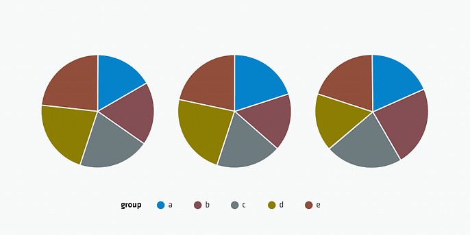
Can you spot the largest segment in each of the three diagrams at first glance? Even if you manage to do so, you cannot intuit the proportions. A completely different picture emerges when the same data is presented as a bar graph:
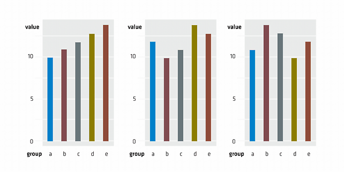
Here you can immediately identify the smallest and largest bar. Therefore, clarity and comprehension are much better served by dispensing with the pie chart in favour of a bar graph. Another problem arises when you want to exclude, or hide, certain categories. In this case, the pie chart will consist of segments that do not add up to 100 per cent.
Two y-axes and their consequences
Whereas in the case of pie charts, capturing the information can be problematic, in the next example it’s the interpretation of what is being presented where things get tricky. I’m talking about line graphs with two different y-axes. They provide an excellent way of presenting a lot of information in a single graph, with the added bonus of allowing you to visually compare the progressions of both curves directly. However, if different scales are applied to the two y-axes, this can quickly lead to erroneous conclusions.
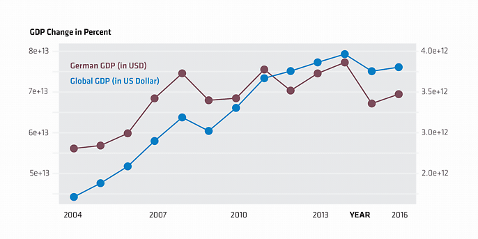
The graph shown seems to suggest that German GDP develops in parallel with that of the world as a whole and follows the same temporal pattern. But you should study it with caution! Both the magnitude and the range represented by the two curves are fundamentally different. In fact, the rise of the blue curve over the course depicted is 80 per cent, but that of the red curve is only 40 per cent. To clearly visualise this difference, both y-axes must start at least at zero.
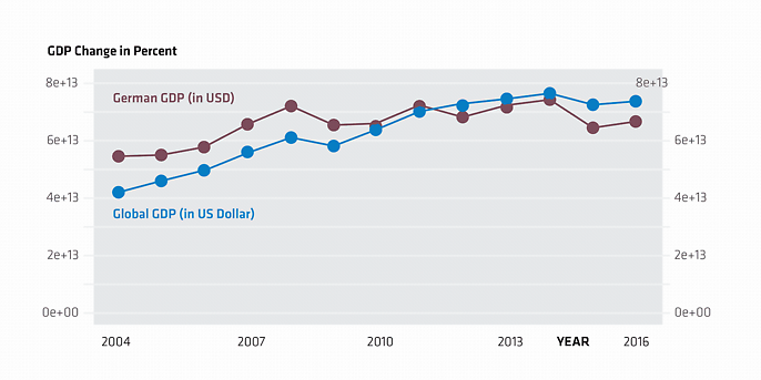
Now it is plain to see that the blue curve is rising more strongly than the red curve. But even this kind of representation exploits our intrinsic desire to relate objects. As a result, many viewers will come to the conclusion that German GDP was higher initially before it was surpassed by the global GDP in 2011. This conclusion, too, can be eliminated by choosing a different method of presentation:
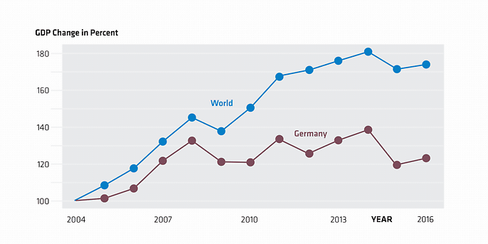
By using an indexed scale as the y-axis, both curves can still be plotted on one graph without compromising on the clarity of the temporal differences of the developments.
Y-axes – round 2
Part of the problem outlined with using two y-axes was plotting the curves based on different value ranges. This leads us directly to the next hotly debated question of data representation: Is it permissible to interrupt/compress the y-axis, or is it considered good practice to display the entire range? The answer, of course, is a resounding ‘yes, but no’. Nevertheless, let’s discuss an example where the use of an extract of the entire information strongly influences the message conveyed by the chart. Take a look at the bar graph below:
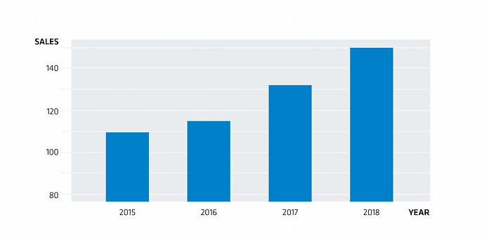
What a success! Sales have literally exploded, and we see a clear upward trend – at least that is the impression that is being given. But when you take a close look at the y-axis, you will notice that the graph only includes values between 80 and 150, which means that all bars are actually truncated at the bottom. Let’s take a look at the same sales figures in a graph where the bars are not cut short:
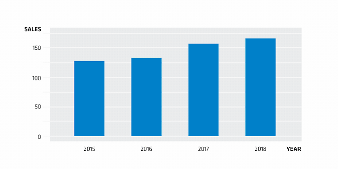
Yes, admittedly there is still a positive trend, but the dynamics are completely different. In general, the height of the bar conveys a message, and therefore the entire bar should be visible. For line charts, where the focus is often on relative development, it can be justifiable to compress the y-axis for the purpose of better illustrating a certain point.
Conclusion
The examples illustrate that a good visual presentation is about more than just picking nice colours. In our effort to provide clear insights, we should make it as easy as possible for the viewer to draw the correct conclusions from a representation. But ‘good’ and ‘right’ are not absolute standards, of course, and what is good in one case may not be appropriate in another. It is therefore a matter of making a conscious decision for or against a particular mode of representation. Naturally, people may and will disagree, but how about taking up this discussion over a piece of cake?
Would you like to learn more about exciting topics from the world of adesso? Then check out our latest blog posts.

